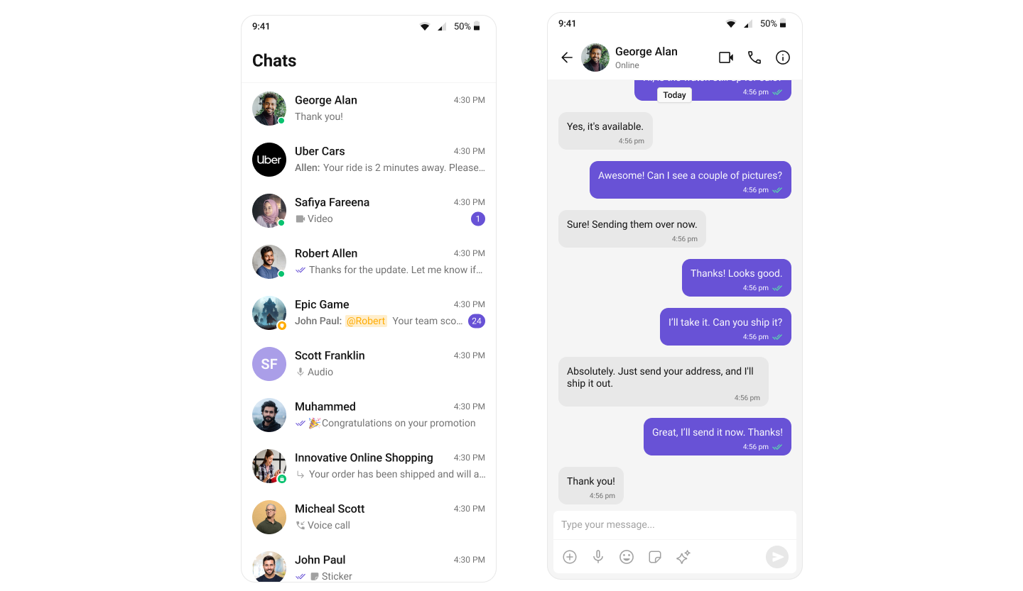
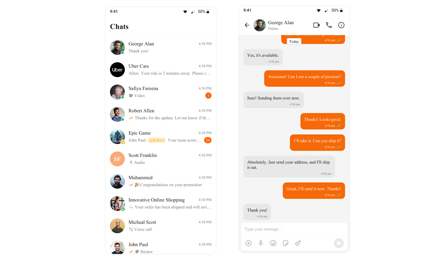
Overview

Theming in CometChat allows you to create visually consistent and customizable user interfaces that align with your application’s branding. The CometChatTheme.DayNight style is built on Theme.MaterialComponents.DayNight.NoActionBar and serves as the global theme applied across all CometChat components. With theming, you can:
  • Seamlessly integrate light and dark modes
  • Define custom colors and typography
  • Apply component-specific styles
  • Maintain consistent branding across your app

Quick Start

Step 1: Set Up Your Theme

Create or update your themes.xml file and extend CometChatTheme.DayNight:
themes.xml
<resources>
    <style name="AppTheme" parent="CometChatTheme.DayNight">
        <!-- Your customizations go here -->
    </style>
</resources>

Step 2: Apply Theme to Your Application

In your AndroidManifest.xml, set the theme for your application:
AndroidManifest.xml
<application
    android:name=".YourApplication"
    android:theme="@style/AppTheme"
    ...>
    <!-- Your activities -->
</application>

Step 3: (Optional) Apply Theme to Specific Activities

If you need different theming for specific activities:
AndroidManifest.xml
<application
    android:theme="@style/AppTheme"
    ...>
    
    <activity
        android:name=".ChatActivity"
        android:theme="@style/ChatTheme" />
        
</application>

Basic Customization

Changing Primary Color

The primary color is used throughout the UI for buttons, highlights, and interactive elements:
themes.xml
<style name="AppTheme" parent="CometChatTheme.DayNight">
    <item name="cometchatPrimaryColor">#F76808</item>
</style>

Common Theme Attributes

Here are some commonly customized theme attributes:
themes.xml
<style name="AppTheme" parent="CometChatTheme.DayNight">
    <!-- Primary brand color -->
    <item name="cometchatPrimaryColor">#6851D6</item>
    
    <!-- Background colors -->
    <item name="cometchatBackgroundColor">#FFFFFF</item>
    <item name="cometchatBackgroundColorSecondary">#F5F5F5</item>
    
    <!-- Text colors -->
    <item name="cometchatTextColorPrimary">#000000</item>
    <item name="cometchatTextColorSecondary">#666666</item>
    
    <!-- Border and divider colors -->
    <item name="cometchatStrokeColor">#E0E0E0</item>
</style>

Light and Dark Mode

CometChatTheme.DayNight automatically supports both light and dark modes based on the system setting. To customize colors for each mode:

Create themes-night.xml

Create a values-night folder and add themes.xml:
values-night/themes.xml
<resources>
    <style name="AppTheme" parent="CometChatTheme.DayNight">
        <!-- Dark mode colors -->
        <item name="cometchatPrimaryColor">#8B7FFF</item>
        <item name="cometchatBackgroundColor">#1A1A1A</item>
        <item name="cometchatTextColorPrimary">#FFFFFF</item>
    </style>
</resources>
The system will automatically use the appropriate theme based on the device’s dark mode setting.
For a complete list of theme attributes, visit the theme attributes file on GitHub.